
Maps. Who doesn’t love a good map? They show us where things are, and they ask for nothing in return. Sure, during their time, they’ve probably witnessed thousands of brutal, marriage-ending, car arguments between middle-aged couples. But, let’s be fair, that’s not really the maps’ fault. That’s more the disintegration of love itself.
With the unrelenting rise of technology, and our over-reliance on Google Maps and Sat-Navs, the cartography genre (if you can call it a genre) is going a bit stale. Like a subsiding fart from the backside of Albus Dumbledore, the very magic of maps is fading away. If we’re not careful, and we continue down the path we’re on, we’ll end up living in some sort of generic map dystopia.
“Nooooooooooooooooooooo”, I hear you cry, “…say it ain’t so.”
Well dry your eyes, and wipe away those salty tears my friend, because we’ve just compiled a list of the weirdest, funniest, and most adorably-crap maps in history. You can pretty much just go ahead and throw your smart phone away because, from now on, these maps are the only maps you’ll need.
*Don’t actually throw your smart phone away, most of these maps are quite shit at being functioning, understandable, maps.*
1) John Bull, Bombarding The Bum-Boats (1793)
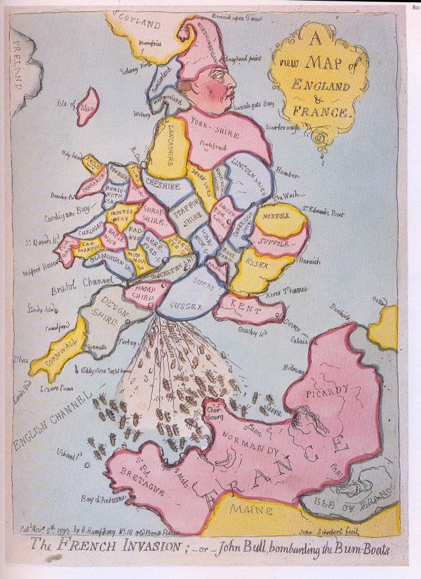
Let’s face it, this map has everything you want in a map. There’s a rosy-cheeked man, shaped like Britain, presumably called John Bull, shitting boats directly into the mouth of an angry-looking France.
We’re going to break this map down further because we don’t have anything else we’d rather be doing. Southampton is shown to be Britain’s anus, Normandy the shit-eating mouth of France, and the “bum-boats”; well they’re the poo.
2) The Island Of California (1533)
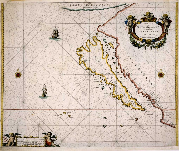
Behind every good map, lies an even better story. If someone hasn’t already claimed this wise and profound map saying for their own, I’d like to take the opportunity to do so and copyright it immediately. Before you start jeering loudly, and throwing eggs at your computer screen, allow me to tell you the interesting story of the ‘Island of California’ map. It’s quite interesting…honestly.
In 1533, an expedition led by Hernan Cortes discovered a strange new land. It was California. But before Cortes, and his seafaring lads, could do a full exploration of the “island”; they were forced to sail away. Convinced it was an island, they told all their mates back home, who told all their mates, and so on and so forth.
Incredibly, it wasn’t until 1774 that another expedition discovered the truth. Of course, by that point, Cortes had long since kicked the bucket so nobody could confront him and be like “Hey Hernan! What yo’ playin’ at fool?!”
3) The Fool’s Cap Map (1580s)
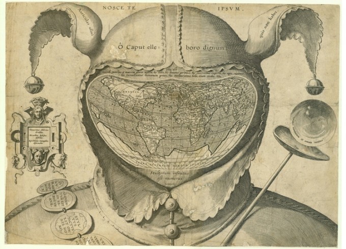
Without question, one of the most disturbing maps we’ve ever seen. It’s called the ‘Fool’s Cap Map’ and it shows, for no discernible reason, a court jester with a map of the world stapled onto his face. Academics have suggested this map symbolises the world’s never-ending ability to do foolish things. Whatever it means, it’s weird.
The map, for your information, is dated in the 1580s and is believed to be of Belgian origin. Oh, Belgium. You’ve always been a crazy bunch what with your waffles, and your chocolate, and your Tin-Tin, but the creation of this frightening map has to be considered a step too far…even for you Belgium….EVEN FOR YOU.
*Apologies to our Belgian readers. We actually really like Belgium, especially Marouane Fellaini and Christian Benteke. They’re great.*
4) Japanese Propaganda Map, 1904
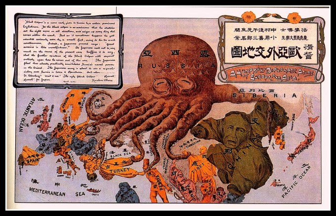
In 1904, Japan were at war with Russia. Never one to shy away from strange shit, Japan released a variety of propaganda poster-maps around this time in which Russia resembled a giant sleeping octopus.
The symbolism of it’s tentacles reaching into Europe and Asia simultaneously will be right up the street of anyone who really digs symbolism. Our only disappointment, in all this, is that the creators of Pikachu never ever gave us a 10,000 kilometre wide Pokémon called Sovietuni-mon. That would definitely have been a shiny.
5) Map Of The Square And Stationary Earth (1893)
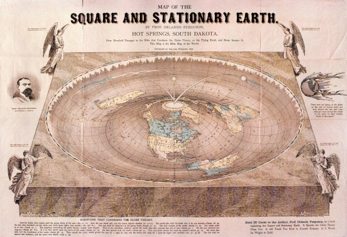
Drawn in 1893, the ‘Map Of The Square Stationary Earth’, is infamous in map-drawing circles for being spectacularly stupid. Professor Orlando Ferguson, who really should have known better, drew the map in order to disprove the theory that the world was globe-shaped (a pretty concrete theory by 1793, let alone 1893).
As a map, it fails spectacularly on a number of levels. None of it, literally none of it, makes any sense whatsoever. The four levitating angels holding us up, the inverted curvature of the oceans, and the fact the world is portrayed as some sort of giant roulette table…for a start. Sorry Orlando, your map sucks.
6) Bunting’s Clover Leaf Map (Pre-16th Century)
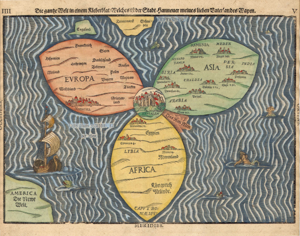
Before discovery and science stopped playing pubs, and started playing stadiums, it was common for mapmakers to draw Jerusalem as the central point of the world.
Our favourite thing about Heinrich Bunting’s charmingly-bad, pre-16th century map is the laziness of the shapes used to represent Europe, Asia, and Africa. You get the feeling that Bunting felt he had better places to be than the map-drawing studio, so he’s just half-arsedly drawn a three-leaf clover and said, “…ah, fuck it, that’ll do.”
7) World Map Before Discovery Of America (1493)
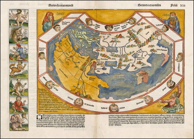
Our favourite thing about this map, apart from the multi-coloured mountains and hilariously incorrect continent shapes, is the fat little faces doodled in the white border. They appear to be blowing wind onto the world because, you know, someone has to keep the ships moving
With all the technology at our disposal now, It’s easy for us to point and laugh at crap old maps like this. It’s easy, so we will. Ha-Ha-Ha-Ha-Ha, 1493-ers! You were ill-equipped, ill-informed, and your maps were woefully inaccurate.
8) Old Lady Riding Backwards On A Fish (1791)
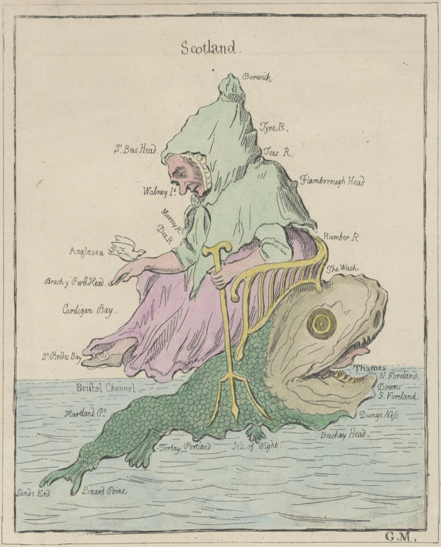
Never, in all our lives, have we seen someone garner so little enjoyment from riding backwards on a fish while holding a trident. In the old lady’s defence, she and the fish are merely a symbolic representation of England and Wales (dated 1791).
The fish’s head appears to be London, and the surrounding home counties, while it’s long green tail seems to cover Cornwall and the rest. The old lady’s body and legs accounts for the Midlands and Wales, while her forlorn-looking head represents the North. The artist couldn’t be bothered to draw Scotland, so they just wrote the word ‘Scotland’ instead.
9) The Weather Penis (2010)
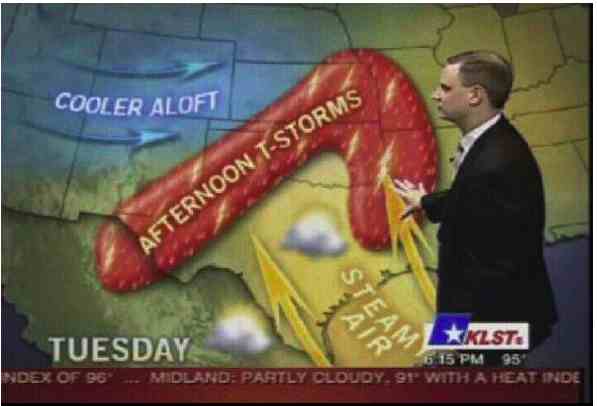
As you can see, this is a weather map for a non-specified Tuesday…
What did you say?
It looks like a what?
A big red cock?!
A BIG RED COCK?!
A big red cock with “AFTERNOON T-STORMS” tattooed down the side of it?!
And the weatherman, you say, is gently tickling the enflamed and sore-looking scrotum with his hand?!
Nope. Sorry. We just don’t see it.
10) The Moon Geology Map (1960s)
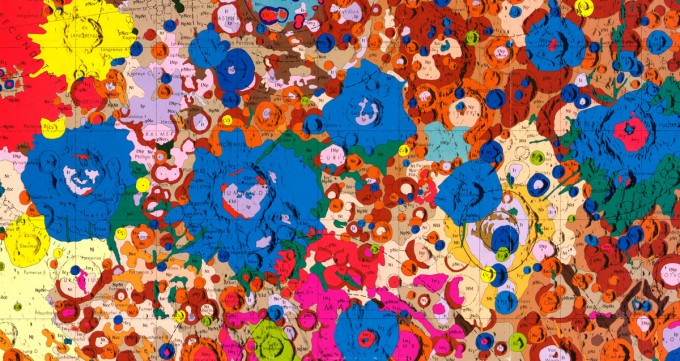
Anyone who says the US Geological Service doesn’t know how to party, definitely needs to check out this geological map of the moon they made in the 1960s.
Look, we get it. The 1960s was a time of experimental drug use, widespread sexual adventure, and cartographers who got off on drawing maps while trippin’ balls. One look at this Jackson Pollock jizz-fest tells you everything you need to know about the US Geological Service. They certainly put the ROCK ‘n’ roll back into geology, that’s for sure.
*Because geology is the study of rocks and, well…you know………..*