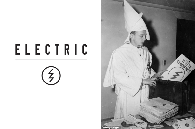
Oops, how’s this for an unfortunate mistake? Electric Eyewear have apparently removed their new lightning bolt logo from their website after eagle-eyed internet users pointed out that it looked suspiciously like one found on secret documents published by the Ku Klux Klan!

Short of rebranding your company with a classic “hindu peace symbol”, it’s hard to think of anything much worse really isn’t it?

Agnarchy and our friends at Boardistan reported the similarities in the logos a few days’ ago and then noticed yesterday that Electric’s website header had changed and the lightning bolt was nowhere to be seen.
The logo does however still appear on a lot of electric gear, including their watches, sunglasses and goggle straps.
To make matters worse…
To make matters worse, the design – an “updated” version of their classic lightning bolt – was pretty new.
It was unveiled with much fanfare at the ISPO boardsports tradeshow in Munich last year, and rumour had it at the time that the company had spent a fair bit on the rebrand.
The unfortunate new logo was unveiled with much fanfare last year.
Which makes it all the more unfortunate that someone in their graphics department had failed to do their research properly.
Of course there’s no suggestion that Electric are in any way racist or connected to KKK activities from 60 years ago, but it’s one hell of a mistake to make.
I just feel sorry for the poor bastard who had to break the news to the CEO: “Errr boss, I think you should probably see this…”